I’m interning for my final year dissertation. My main goal is to find associations between medical data and connectomes (map of neural connections in the brain). After lot of processing on the MRI Images, I end up having a square matrix with the estimated connectivity between the different brain areas.
A square matrix full of numbers is not the easiest thing to interpret for a human, so I decided that I needed a tool to be able to iterate over the brains in the different studies and quickly “understand” them. The classic approach that they suggested me was to do a correlation matrix with a heatmap. I find them difficult to understand so I wanted to copy some of the chord diagrams I saw before in some articles and posters. Most of the chord graphs visualizations I found on google were done with d3.js; which is not easy to integrate on a Python workflow.
Matplotlib, Seaborn or Bokeh are the libraries I’m used to work with, so I took it as a personal challenge and I started the adventure of creating a chord graph with one of those libraries. I like interactivity a lot, so I finally end up using Bokeh.
Creating a circle of dots
The first idea I came up with was to assign each area a dot in a circle an then draw the connections between the areas. I made a function to create dinamically the x and y of each point in a circle given a n number of areas; as I might use different approaches sometimes.
from math import pi, cos, sin

def draw_circle_points(points, radius=1, centerX=0, centerY=0):
    part = 2 * pi / points
    final_points = []

    for point in range(points):
        angle = part * point;
        newX = centerX + radius * cos(angle)
        newY = centerY + radius * sin(angle)
        final_points.append((newX, newY))

    return final_points
Creating the lines
Now that I had each area as a point in the graph, I needed to add the lines from one area to the other using the x,y array I just got. In order to remove the connections that were very weak, I added a hardness parameter to the function that will ignore those area connections connected by less than 20 estimated connections.
import numpy as np
# Emulate a connectome
connectome = np.random.randint(0, 1000, size=(85,85))

def connectomme_lines(connectome, hardness=20):
    number_of_areas = connectome.shape[0]
    positions = draw_circle_points(number_of_areas)

    final_positions = []
    area_name = []

    for index, area1 in enumerate(connectome):
        commonXY = positions[index]
        for index2, area2 in enumerate(area1):
            newXY = positions[index2]
            if area2 > hardness:
                final_positions.append([[commonXY[0], newXY[0]], [commonXY[1], newXY[1]]])

    return final_positions

lines = np.array(connectomme_lines(connectome)).T
The lines array was generated and it needed to be transposed to be easier to work with it.
Let’s plot this !
Time to make Bokeh work. As I was going to plot lot of lines, curved lines (bezier lines) seemed a better option than straight lines. I gave a fixed curvature to all of them so I didn’t have to worry about that.
from bokeh.plotting import figure, output_notebook, show
from bokeh.models import Range1d

p = figure(title="Connectomme", toolbar_location="below")

p.x_range = Range1d(-1.1, 1.1)
p.y_range = Range1d(-1.1, 1.1)

p.bezier(x0=lines[0][0],
         y0=lines[0][1],
         cx0=lines[0][0]/2,
         cy0=lines[0][1]/2,
         cx1=lines[1][0]/2,
         cy1=lines[1][1]/2,
         x1=lines[1][0],
         y1=lines[1][1])

show(p)
A preview:
So we had a bunch of lines in the form of a chord diagram, but nothing easy to understand. I thought that giving each line the color of the area it was originated from could be a great idea. Other thing that the graph was not considering at the moment was the number of connections between the areas; zero to thousands depending in the case. Standardization of the number of connections and plotting them as the difference in the width of a connection seemed like a good approach to quantify the strength of the connection.
Counting the number of connections
To modify the width of the lines, we just need add one parameter to our bezier object.
def width_of_lines(c, hardness=20):
    f = c.flatten()
    flat = f[(f > hardness)]
    return flat/flat.sum()
As the standardized values were too low for bokeh, I broadcasted a multiplication to be able to have some visible lines.
connections_standardized = width_of_lines(connectome) * 150
In order to create the glyphs information only once and reuse it in different plots, ColumnDataSource let’s you define the data in a variable and then use it when you create a glyph in a plot.
Now the plot, the glyphs and the data source were three different things defined independently.
from bokeh.models import ColumnDataSource
# The Data
beziers = ColumnDataSource({
            'x0' : lines[0][0],
            'y0' : lines[0][1],
            'x1' : lines[1][0],
            'y1' : lines[1][1],
            'cx0' : lines[0][0]/1.5,
            'cy0' : lines[0][1]/1.5,
            'cx1' : lines[1][0]/1.5,
            'cy1' : lines[1][1]/1.5
        })

dots = ColumnDataSource(
        data=dict(
            x=positions[0],
            y=positions[1]
        )
    )
# The Plot
p2 = figure(title="Connectomme", toolbar_location="below")
p2.x_range = Range1d(-1.1, 1.1)
p2.y_range = Range1d(-1.1, 1.1)
# The Glyphs
p2.bezier('x0', 'y0', 'x1', 'y1', 'cx0', 'cy0', 'cx1', 'cy1',
          source=beziers,
          line_cap='round',
          line_width=connections_standardized) # Add the width

p2.circle('x', 'y', size=8, fill_color="#6D6A75", line_color=None, source=dots)
show(p2)
When adding the curve glyphs to the plot line_width set the width of each line.
Coloring the brain
 Coloring the brain wasn’t something new for me, but in this case assigning so
many areas a unique color required some research in color theory.
Coloring the brain wasn’t something new for me, but in this case assigning so
many areas a unique color required some research in color theory.
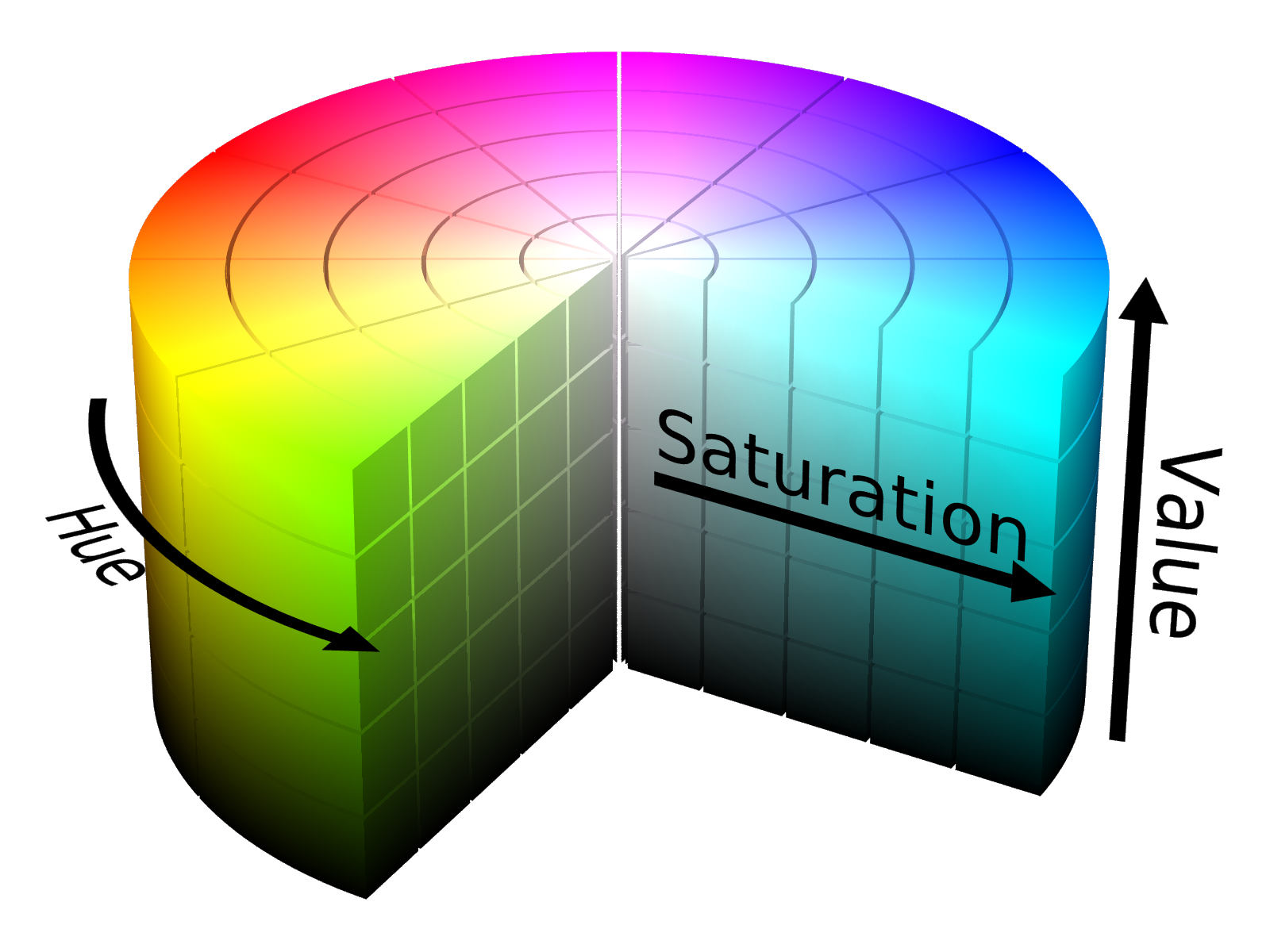
Creating random color values without too dark or too bright colors is not an easy task. There are different ways of defining a color but the most usual one is using RGB, that stands for red, green, blue. If you use RGB to create random color, the usual output is to have some awful colors that variate a lot in their brightness. I found out that using the HSV method (hue, saturation, value), you can set two of the parameters fixed and generate random colors in a similar color space just by modifying the hue.
from colorsys import hsv_to_rgb

def gen_color(h):
    # Source: http://www.goldennumber.net/color/
    golden_ratio = (1 + 5 ** 0.5) / 2
    h += golden_ratio
    h %= 1
    return '#%02x%02x%02x' % tuple(int(a*100) for a in hsv_to_rgb(h, 0.55, 2.3))

area_colors = [gen_color(area/connectome.shape[0]) for area in range(connectome.shape[0])]
I needed now to iterate over the matrix to assign each line the correct color depending in the area it was originated from.
def lines_colors(connectome, area_colors, hardness=20):
    colors = []
    for index, area1 in enumerate(connectome):
        area_hsv = area_colors[index]
        for area2 in area1:
            if area2 > hardness:
                colors.append(area_hsv)
    return colors

area_colors_lines = lines_colors(connectome, area_colors)
Now let’s plot the same chord diagram with colors
p3 = figure(title="Connectomme", toolbar_location="below")

p3.x_range = Range1d(-1.1, 1.1)
p3.y_range = Range1d(-1.1, 1.1)

p3.bezier('x0', 'y0', 'x1', 'y1', 'cx0', 'cy0', 'cx1', 'cy1',
          source=beziers,
          line_cap='round',
          line_width=connections_standardized,
          line_color=area_colors_lines
         )

p3.circle('x', 'y', size=8, fill_color=area_colors, line_color=None, source=dots)
Adding interactivity to the plot
Having such a cool plot needed a way to interact with it. Bokeh offers some tools like HoverTool for that. The hover tool displays informational tooltips whenever the cursor is directly over a glyph, in this case I used the circles to show the area it was representing.
import pandas as pd
area_names = pd.read_csv('area_names.csv')
area_names.columns = ["num", "names"]
area_names["names"] = area_names["names"].map(str.strip)
The dot’s data was modified again, as we needed to include the data to be shown when the mouse is hover the point.
from bokeh.models.tools import HoverTool
# Area's dots
dots_interactive = ColumnDataSource(data=dict(x=positions[0],
                                              y=positions[1],
                                              desc=list(area_names["names"]))
                                    )

# Hover tools
hover_dots = HoverTool(
    tooltips=[("Area", " @desc")],
    point_policy='snap_to_data'
)
We plot again.
p4 = figure(title="Connectomme", toolbar_location="below")

p4.x_range = Range1d(-1.1, 1.1)
p4.y_range = Range1d(-1.1, 1.1)

p4.bezier('x0', 'y0', 'x1', 'y1', 'cx0', 'cy0', 'cx1', 'cy1',
          source=beziers,
          line_cap='round',
          line_width=connections_standardized,
          line_color=area_colors_lines
         )

p4.circle('x', 'y', size=8, fill_color=area_colors, line_color=None, source=dots_interactive)
We include the new tool and Voilá !
p4.add_tools(hover_dots)
show(p4)
NOTE: The order of the labels in this specific case is not the correct one. I’ll correct it soon.
And this is so far what I did but this still work on progress and I’ll show more soon. Thanks for passing by !